
Remote sensing fun. Elevation maps, satellite imagery, NDVI, DSMs, BGT buildings, AI classifications, computational models: they’re all wonderful. But then comes the question that really matters: how are you going to present the results? Because an analysis is only truly valuable if others can work with it. Not just the geospatial specialist who performed the calculation, but also the policy officer, project manager, administrator, or resident who wants to know: where are the opportunities, what are the benefits, and where do you start?
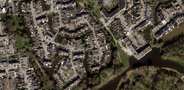
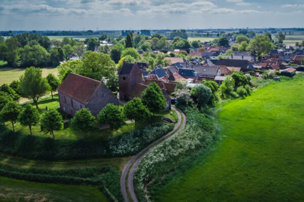
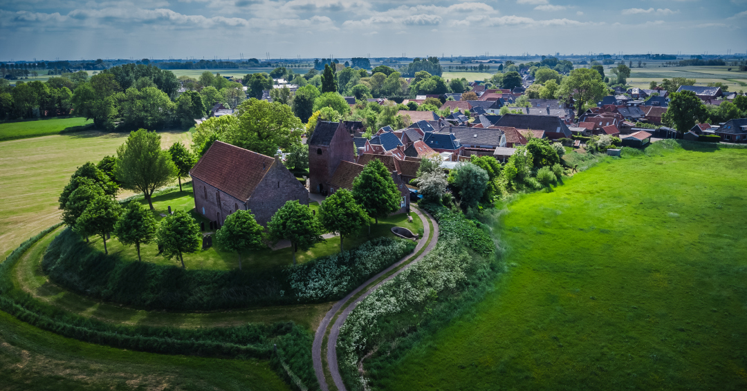
In this fifth installment of the series, I’ll show you how to translate remote sensing into a dashboard. We’ll leave Ezinge for a moment and head over to Capelle aan den IJssel. Not because Ezinge is any less interesting, but because a larger and more anonymous urban environment better illustrates why a dashboard is so important.
Looking Back: Look First, Then Visualize
In the previous parts, we took a step-by-step lookat flooding, elevation maps, green roofs, and detecting vegetation using satellite data. In part four, I emphasized that you must first understand what you’re looking at. Which sensor are you using? What is the resolution? Where does the data come from? And what does that data actually tell us—and what doesn’t it? That’s important, because a dashboard can look very convincing. Beautiful maps, graphs, totals, and colors can quickly give the impression that everything is correct. But if the underlying data isn’t properly understood, you’re essentially building a beautiful misconception. That’s why this dashboard isn’t the starting point, but the result of a series of steps: observe, combine, calculate, verify, and only then present.
From Ezinge to Capelle aan den IJssel
Ezinge is the perfect place to lay out the basics. You can clearly see the village, the mound, the elevation changes, and the waterways. But for a dashboard, you also want to show scale. What happens when you’re not looking at just a few streets or a single village, but at thousands of buildings across multiple districts and neighborhoods?
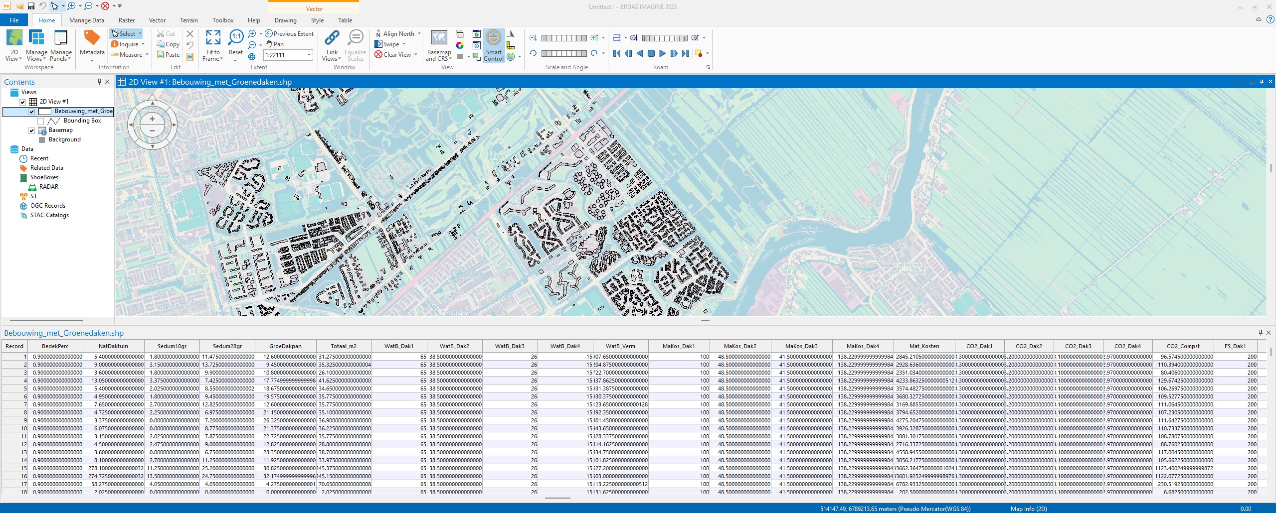
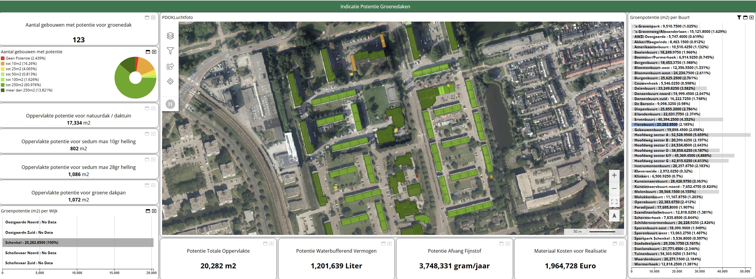
That’s why I’m using Capelle aan den IJssel as an example here. The dataset behind the dashboard contains over 14,000 properties with dozens of characteristics. These include year of construction, housing type, district, neighborhood, potential roof area, type of green roof, water retention capacity, particulate matter capture, and material costs. When you open that data as a table, all you see are rows and columns. Lots of rows and lots of columns. You can crunch the numbers, but you still can’t see where the opportunities lie. And that’s exactly where the dashboard comes in.
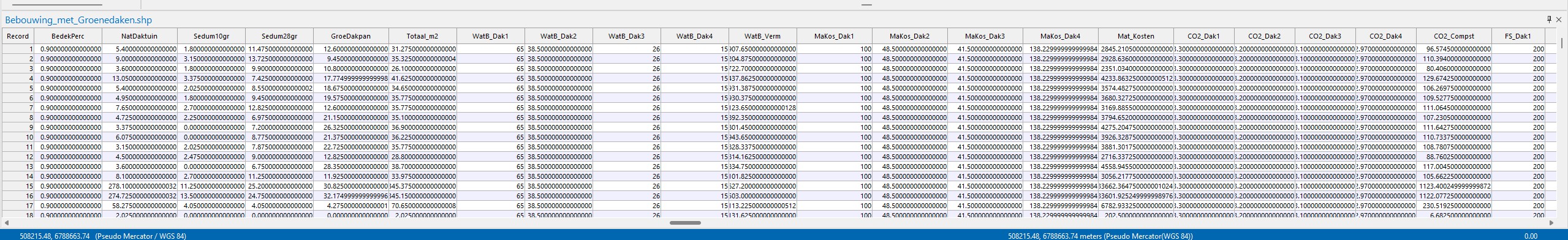
Why a CSV file alone isn't enough
The provided dataset contains over 14,000 rows and 49 columns. While this is perfectly manageable for a computer, it isn’t immediately clear to a human. You see columns such as NatDaktuin, Sedum10gr, Sedum28gr, GroeDakpan, Totaal_m2, WatB_Verm, Mat_Kosten, and FS_Afvang. To a geospecialist, this is familiar. But for someone who has to make decisions about greening, water storage, or budgets, it quickly becomes a jumble of data.
Yet there is significant value here. The CSV includes approximately 916,000 m² of potential green roof area. Based on the calculation parameters used, this results in a potential water retention capacity of nearly 39 million liters. Particulate matter capture is also factored in: over 125 million grams per year. The estimated material costs amount to approximately 91 million euros. Those are big numbers. But big numbers alone don’t provide an answer. Because where exactly is that potential? In which district? In which neighborhood? Are we talking about many small roofs or just a few large areas? And which type of green roof is suitable for which location?
Without a dashboard, you have to extract all that information from tables and charts. With a dashboard, you can see it right away.
What does the dashboard show?
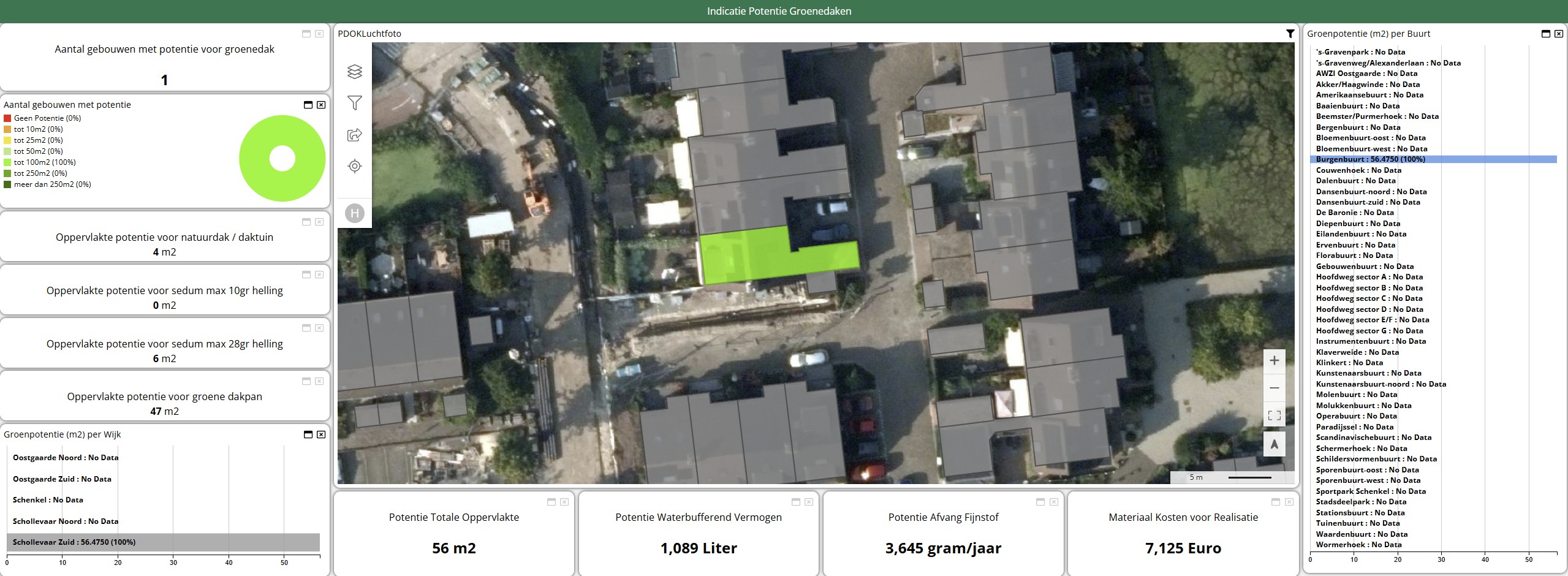
The map shows you which buildings have potential for a green roof. The colors distinguish between different types or amounts of potential roof area. You can zoom in on a district, neighborhood, or even a single building. If you click on a building, you’ll not only see that there is potential, but also the calculations behind it. These include the surface area, the type of green roof, the water retention capacity, particulate matter capture, and the estimated material costs. This transforms the map from a pretty picture into a management tool.
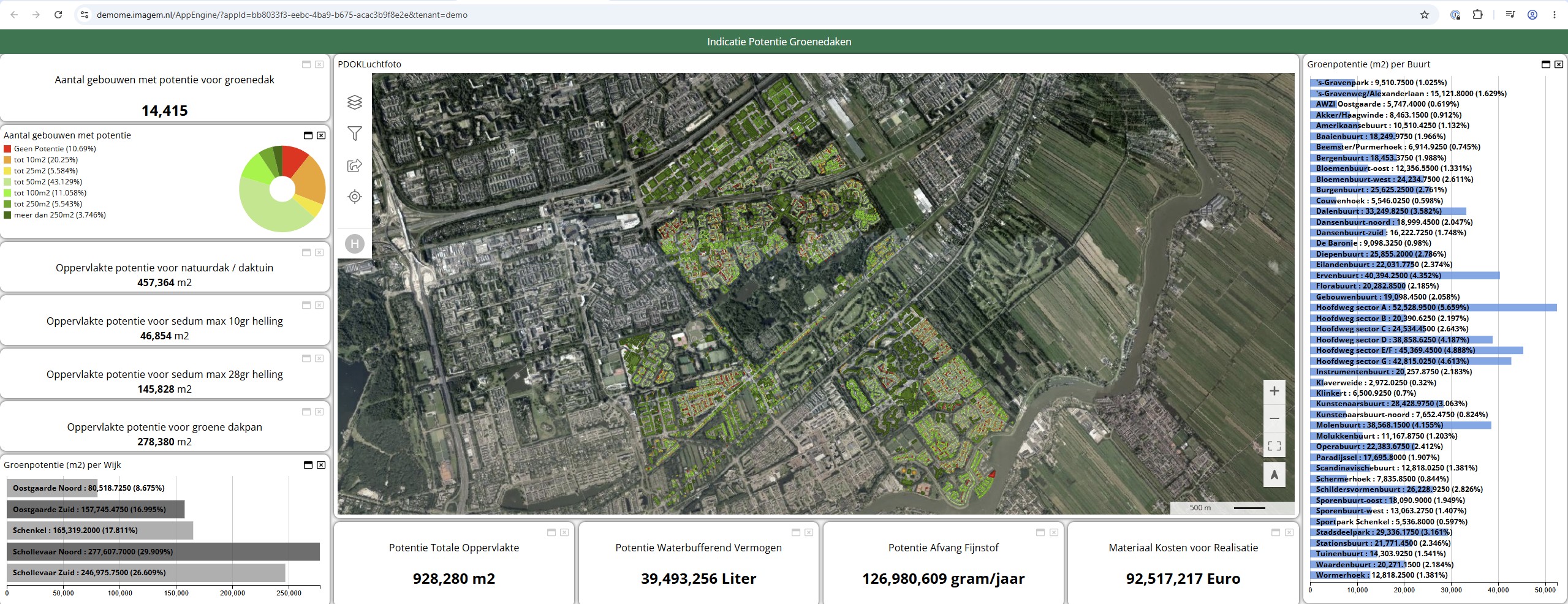
The summaries are located on the left and bottom of the dashboard. There, you can see, for example, how many buildings have potential, how the roof areas are distributed, and which neighborhoods contribute the most. On the right, you can see the neighborhoods with the greatest potential. This is important because not every roof requires the same approach. For example, the dataset shows that a large proportion of the buildings have a potential surface area of up to 50 m². At the same time, there is also a smaller group of buildings with more than 250 m² of potential roof area. Both groups are interesting, but require a different strategy. Many small roofs can be suitable for a resident-focused approach. Large roofs, on the other hand, are ideal if you want to quickly achieve a large number of square meters, water storage, or particulate matter reduction.
From building to neighborhood
A dashboard allows you to switch between different levels of detail. You can view a single building, or an entire neighborhood. In this dataset, Schollevaar Noord and Schollevaar Zuid stand out. Together, these neighborhoods account for more than half of the total potential roof area. If you look only at the numbers, you can see that too. But it’s only on the map that you can see how that potential is distributed. Is it spread out across residential streets? Is it mainly on larger buildings? Are there clusters where you can achieve more with an area-specific approach? You can’t really answer those kinds of questions with just a table.
Things get interesting at the neighborhood level, too. Neighborhoods such as Hoofdweg Sector A, Hoofdweg Sector E/F, Hoofdweg Sector G, and the Ervenbuurt stand out clearly. A dashboard not only shows that these neighborhoods score highly, but also explains why. You can see their location, their clustering, and how they relate to the building structure.
And that is exactly where visualization adds value.
More than just square footage of green space
A green roof is more than just a green surface on a building. It can contribute to water retention, cooling, biodiversity, and air quality. This dashboard clearly highlights water retention capacity and particulate matter capture in particular. This makes the discussion more concrete. You no longer have to simply say, “There are opportunities for green roofs here.” You can also show what those opportunities might yield. How many liters of water can be retained? How much particulate matter can be captured? What is the estimated investment? And in which neighborhood does a measure yield relatively high returns? This is valuable for municipalities, water authorities, and area developers. Not because the dashboard perfectly predicts reality, but because it helps to substantiate decisions. The dashboard bridges the gap between data and discussion.
A dashboard is not an end in itself
Still, one thing remains important: a dashboard is no substitute for an inspection, a structural engineer, or a conversation with residents or owners. A model can calculate that a roof is a viable option. But after that, you still need to consider load-bearing capacity, ownership, maintenance, accessibility, and community support. The computer can see and calculate a lot, but ultimately, it is up to humans to interpret the results.
We saw this in the previous sections as well. A sensor collects a lot of data, but doesn’t understand anything. A dashboard displays a lot of information, but doesn’t make any decisions. It does, however, help you ask better questions. Where do we start? Which neighborhoods make sense? Which rooftops will have the greatest impact? What is financially feasible? And how do we link climate adaptation, quality of life, and implementation?
What can you do with these insights?
remote sensing data analysis can help you visualize complex issues. But a dashboard also makes them easier to discuss. The power lies not only in the map or the numbers, but in their combination. The map shows where something is happening. The graphs show how much of it there is. The totals show what the impact might be. And the filters make it possible to explore different scenarios.
This makes a dashboard a bridge between technology and policy. The geospatial specialist can explain how the calculations were made. The policy officer can set priorities. The project manager can determine where implementation makes sense. And the administrator can see the potential returns on an investment. Remote sensing the data. The dashboard makes the data usable. Or, to put it more simply: you’ll only use it if you can see it.
Looking Ahead: From Dashboard to digital twin
In this section, we looked at how remote sensing results in a dashboard. The next step is to make this information even more dynamic—for example, by adding scenarios, running budget simulations, or tracking the effects of measures over time. This quickly leads to a digital twin: a digital representation of the environment where data, models, and scenarios come together. But the same lesson applies here: don’t start visualizing just because it looks nice. Start by understanding what you’re measuring. Only then can you build something that not only impresses but also truly helps.
More information
Harald is a Business Consultant at IMAGEM. He bridges the gap between business, sales, and technology, and focuses on delivering value to the client. He collaborates with developers to create solutions for the public safety and security sector, educational institutions, and digital twins.
Would you like to learn more about this topic? Send Harald an email or send a message via our contact form.

Harald Görtz
Business Consultant