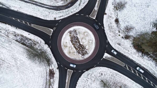

February 18, 2021 – Unfortunately (for some), the snow and ice have already melted away, but they did give us some fun on the ice and a few beautiful images. On February 11, it started snowing from the south, and the photos below capture a stunning scene.
A trove of data
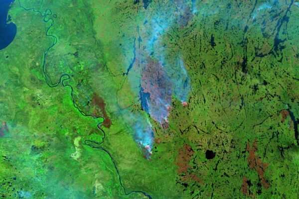
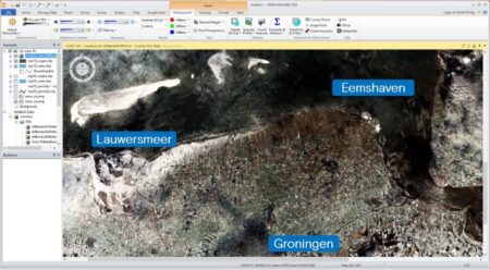
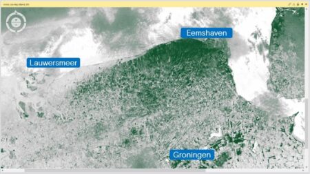
In early February, snow began to fall in the southern part of the Netherlands, and the images below from the Sentinel-2A satellite already show a stunning view. The Lauwersmeer region and Ameland to the north are already blanketed in snow, while not a single flake has fallen near Eemshaven (at that time). However, this is more than just a picture; there is an incredible amount of data in a Sentinel-2 image. How can you gain insight into snow (and related issues), for example? No problem with ERDAS !
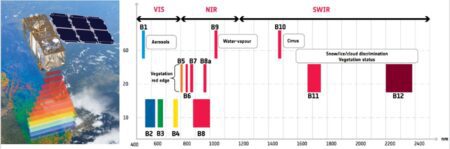
Like a giant vacuum cleaner, as shown in Figure 2 (below), the satellite collects data across 13 different bands of the electromagnetic spectrum as it flies over at an altitude of 786 km. The image it captures covers an area of 110 by 110 km. That’s quite a lot of data.
The data from the various bands, as shown in Figure 2, tell us a great deal about the area being imaged.
Sentinel-2’s range of 13 spectral bands—from the visible and near-infrared to the short-wave infrared—at various spatial resolutions, ranging from 10 to 60 meters on the ground, can be used, for example, to monitor snow and ice. The various sensors, such as those on Sentinel-2, but also on Landsat, Worldview, MODIS, etc., are all recognized by ERDAS . In other words, the software “recognizes” the electromagnetic spectrum of the images and can perform calculations directly using this data.
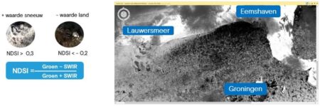
For this monitoring, we use a formula that allows us to calculate the Normalized Difference Snow Index using the green band (560 nm) and the short-wave infrared (SWIR) band. This index has a value ranging from -1 to +1, where negative values can be attributed to snow and ice, while positive values represent, for example, bare ground, vegetation, etc. The lower the value, the more snow or ice is present at that location.
X-ray
The result, Figure 3, is a kind of X-ray image of the area: the lighter the color, the more snow or ice is present in that section. To make the distinction even clearer, we will display the NDSI in white (for snow and ice) and green (for everything that represents little to no snow or ice).
Our “X-ray image” has now been transformed into an artistic white-and-green representation of Northern Groningen. From the Lauwersmeer area, which is already quite white (heavy snowfall), to Eastern Groningen, which shows more green areas (little to no snow).
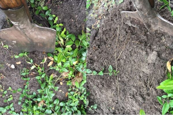
By the way, the next day I saw snowdrifts in my own neighborhood. I immediately used these as " ground truth." This is a term used to compare information obtained through inference (the NDSI calculation) with direct observation (empirical evidence). After all, there should be a lot of snow in the blue areas.
Figure 5 illustrates this well: a snowdrift that has formed along the edge of the ditch. The NDSI thus clearly shows where large amounts of snow have accumulated.
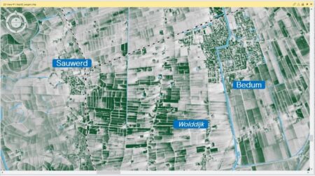
If we look now at the area north of the city of Groningen, between Sauwerd and Bedum, along the Wolddijk, we can see a striking effect of white streaks against the green landscape. This is because the combination of drifting snow and strong winds causes the snow to settle less readily on open ground, while it does accumulate in the lee of trees and houses (along the Wolddijk).
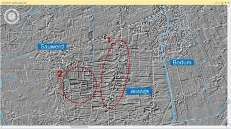
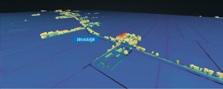
We can see this even more clearly when we create a 3D image—a Digital Twin—of the snow in the area. A Digital Twin involves generating or collecting digital data that represents a physical object. We can create a clear visualization by displaying the NDSI values in relief. The built-up areas (negative values) appear to sink downward, while snow and ice (positive values) come to the fore. The image below clearly shows the snow drifts (area 1 circled in red), and in area 2, we see a pattern of ditches emerge; the ice and snow in the ditch have a high NDSI value.
To take 3D visualization a step further, I use the Actueel Hoogtebestand Nederland (AHN), the digital elevation model for the entire Netherlands. Using this dataset, we can easily display a location in the Netherlands in 3D.
Here we see the Wolddijk in 3D: the higher the terrain—such as trees and buildings—the redder the color.
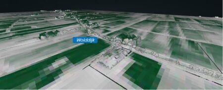
Next, we can use the NDSI to display the AHN in these colors. In the 3D view, we can clearly see how the wind has free rein over the snow in the flat, open countryside, while the snow remains between the houses, in the lee, and also stays on the road.
This allows you Digital Twin quickly and easily Digital Twin a Digital Twin using up-to-date, freely available satellite imagery and gain insight into your surroundings—in this example, snow-related issues.
More information
Harald is a Business Consultant at IMAGEM. He bridges the gap between business, sales, and technology, and focuses on delivering value to the client. He collaborates with developers to create solutions for the public safety and security sector, educational institutions, and digital twins.
Would you like to learn more about this topic? Send Harald an email or send a message via our contact form.

Harald Görtz
Business Consultant